-
Master Bedroom Paint Update
I mentioned earlier this past week that we had updated our bedroom with some new paint. I always love a how changing up the paint color in a room can make everything feel so different. We knew we wanted something light and neutral and had initially considered going with white. However, after some internet searching and comparing the positives and negatives of white paint, we finally decided on the new master bedroom paint color.

When we first moved in, our master bedroom was painted an intense burnt orange color and we kept it like that for several years. Not because we really love burnt orange anything, but because we were not really sure which direction we wanted to go. Plus, if you are anything like us, your own bedroom is put on the back burner to all other home improvements, especially because that is the place were things get shoved to keep company from seeing the mess in your home. *Wink*
Once we were ready to start changing things in the master, we finally decided on Behr Wheatbread as a calming neutral. Then we moved to Boston. And then we moved back. Hey, we tend to move a lot, or at least we have in the past. Here it is with the Behr paint before we changed things up again.
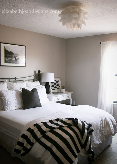
I really loved the look we had going in the photo above with the Behr paint and neutral accessories (I’m such a black and white with stripes kind of girl), however the throw pillow on the bed was chewed up by the dog and the cat claimed the striped throw blanket, so those are no longer there. We also switched back to our old nightstands, since our daughter stole the vanity turned desk to put in her shared bedroom with her little brother. So here is the master, albeit small, bedroom with the newer, lighter paint color, Benjamin Moore Edgecomb Gray and some other accessories.

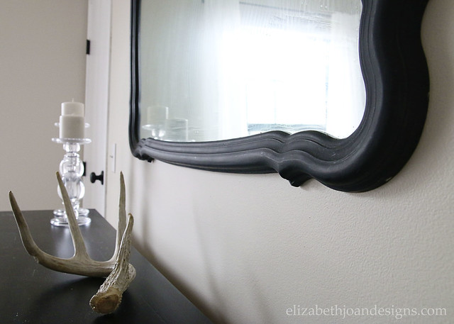
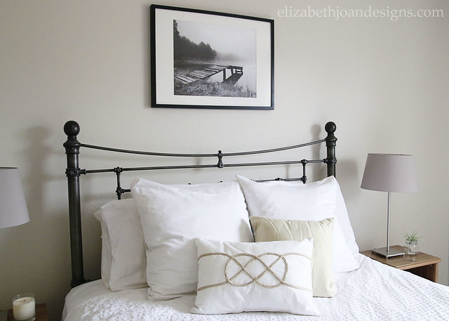
I know that it is hard to tell from the photos, but the new master bedroom paint color is a lot lighter than it was. The new color is a soft, warm greige, that changes in different lighting, which you can see below in the mirror.

I’ve already shared our dresser on the blog before with it’s awesome drop pulls.
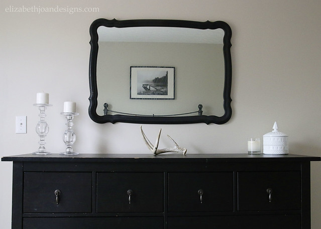
This mirror is one I picked up at a thrift store while visiting my sister in NY. I love the curvy black frame!
Our queen size bed is nothing amazing, although if you were to lay on it, I can guarantee you would sleep well. We are hoping to upgrade to a king in the near future, because, hello… space! The headboard is the Whitney headboard from Pottery Barn and is unfortunately no longer available on their website. Boo. We actually purchased it for a steal on Craigslist about 7 years ago.
The little, faux wood (I think they are laminate) Ikea nightstands were also a Craigslist find. We got them for only $5 each and they have served us well in the years that we have had them, squeezing into tight spaces when our bedrooms have been small. However, we are planning to change them out soon, as well as the cheap-o Ikea lights on top of the nightstands.

So, that pretty much wraps up the master bedroom paint reveal. I know, I know. It was not that exciting (griege can sometimes be a pretty boring color), but having a neutral space to relax in is just what this sometimes stressed out mama needs.

What do you think? Do you prefer simple, neutral painted walls in your home, or you do you like a punch of color to awaken the senses?
-
Affordable Farmhouse Decor
When it comes to money, I am an oxymoron. I love to shop and spend, but saving some money may be one of my favorite things in life. When I decorate my home, I use the same philosophy and always try to find the best deals. Typically, I would describe my decor style as neutral modern farmhouse, so I’ve rounded up a great selection of Affordable Farmhouse Decor that you can snag for less than $40!

This post contains affiliate links for your convenience. Click here for my full disclosure policy.
1. Rustic Metal Arrow – Fun wall decor that could work in almost any room of the house.
2.Wood Framed Topiary – I love topiaries and this cute wood framed option would look great hanging on the wall.
3. Ticking Stripe Pillow Case – We have a couple of ticking stripe pillows in our home and they always look great!
4. White Tin Pitcher – Perfect to display flowers or kitchen utensils.
5. Metal Olive Basket – Great as decor, but also for holding toys.
6. Tin Silverware Caddy – Save drawer space and put your silverware in here. (Also works miracles for corralling art supplies.)
7. Compass Pillow Case – A simple, pretty pillow that has an amazingly low price tag.
8. Graphic Cotton Towel – How cute is this towel for mopping up spills in the kitchen?
9. Wire Storage Basket – These baskets work great in the pantry!
10. Reclaimed Decorative Ladder – I really want a ladder like this to either hang towels or blankets on.
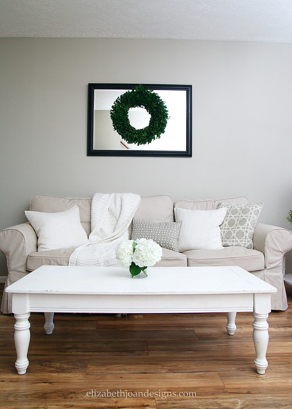
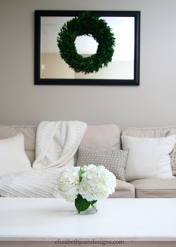
11. Boxwood Wreath – We have a boxwood wreath hanging in our home and it brings so much life to the space. Plus, ours still looks as new as it did when we got it, 1.5 years ago.
12. Framed Chalkboard – The perfect place for grocery lists and reminders.
-
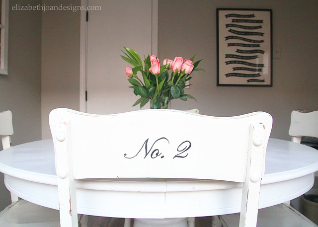
Script Number Chairs
Oh my goodness! This past weekend/week have been crazy for us. I have so much to catch you up on, but that is for another post sometime in the future! Did you happen to catch my Spring Fling Home Tour last week? I shared a few rooms in our home, along with some major updates to our kitchen. I also showed our new breakfast nook set up, which included these pretty white Script Number Chairs.
A long time ago, I talked about wanting to replace or paint the cross back chairs we had, but I was
lazybusy and have not really had time to do anything to them. And then I happened to stumble upon these white beauties.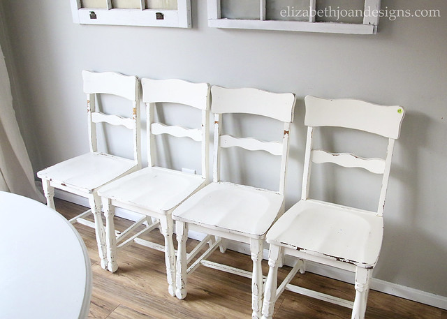
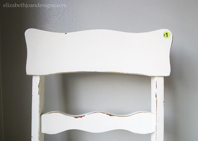
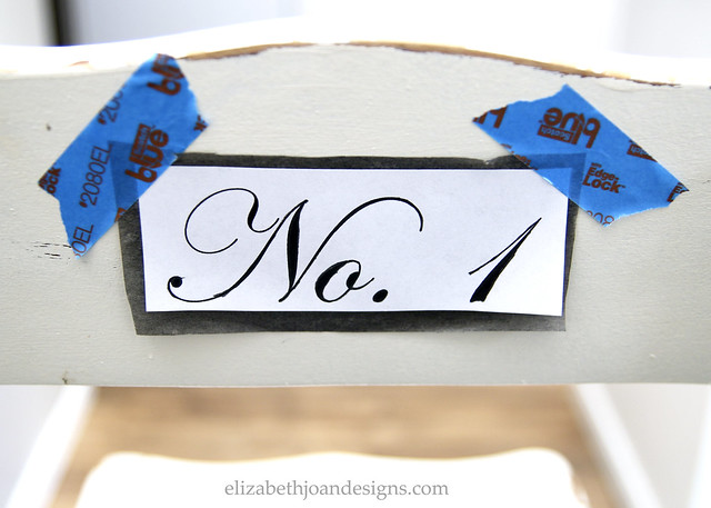
I actually found them at a garage sale for $1 each and for that price, I could not pass them up. Their chippy paint and curvy backs were just screaming my name. Once I got them home, I didn’t really know what I would do with them, since we already had chairs that we were OK with. That is until I saw this photo on Pinterest and I knew I wanted to add some script-y numbers to the white chairs.
The process to add the numbers was pretty simple and one that I had never tried before. I purchased some transfer paper from the craft store and got to work.
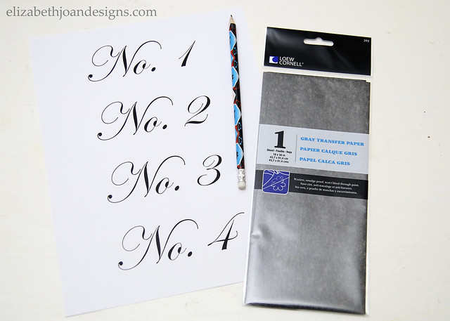
The font I used for the text was Edwardian Script (I did not trace the first little curl on the letters) and I printed the numbers out onto regular ol’ printer paper. After cutting each grouping out, I placed the printed paper over the top of the transfer paper and attached both to the backs of the chairs with some painter’s tape I had on hand.
Next, I traced over each of the letters and numbers with a
Jurassic Worldpencil. Unfortunately, I could not find a small enough paint brush for this project, so I improvised and used my handy-dandyJurassic Worldpencil to also “paint” on the numbers with black acrylic paint. I just dipped my pencil tip in the paint, let it dry, then dipped it again into wet paint and started to go over the text. It wasn’t maybe the easiest of processes, but it wasn’t too hard either. I just had to keep dipping back into the paint.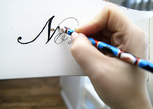
I feel like the text turned out so pretty and delicate on the chairs. It is not a perfectly stenciled image and certainly looks more hand drawn, but I think that it brings a certain charm to each seat.
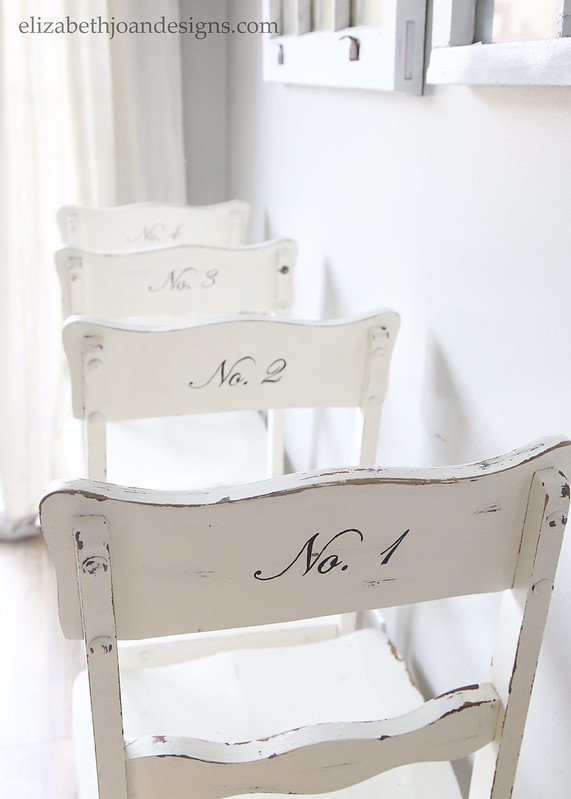
And using the transfer paper may be my favorite new way to get text/images onto a painted or wood surface. (I’ve tried many techniques before, most of which worked wonderfully. See links below.)
I love adding text to decor. What do you think? Do you enjoy a number here or there? Maybe a favorite word or saying? I would love to hear your thoughts in the comments below!
_______________________________________________________________
You may also like:

Cable Spool Clock 

Picture Frame House Numbers 
Industrial Numbered Storage -
Spring Fling Home Tour
It is SPRING!!! I’m so happy that it is spring because the weather will be getting warmer and I can not wait to be outside enjoying the sunshine. Today, I’m sharing my Spring Fling Home Tour! That’s right, I’ve updated everything again for spring with fresh blooms and greenery. And this time, my cat and dog did not eat all of it. *WINK*
Since I just did a St. Patrick’s Day tour, I’m going to let the photos do most of the talking, with a few blurbs here and there as needed.
I would describe our style as neutral, modern, farmhouse. That may or may not be a real style, but I’m going with it.
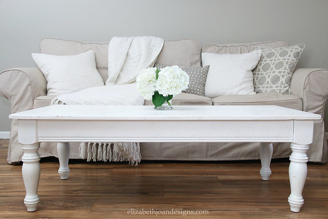
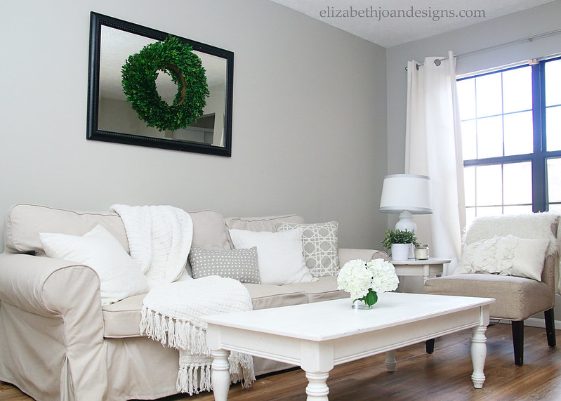
In our living room, I moved a mirror and boxwood wreath above the sofa and kept the decor simple with a few of my favorite flowers, hydrangeas.
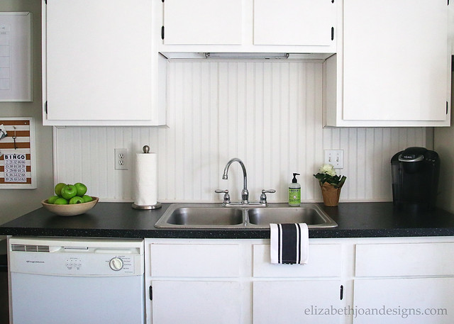
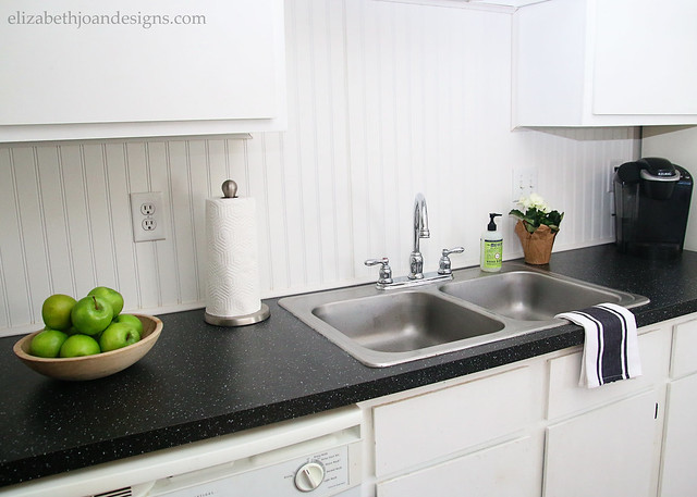
Our kitchen was recently updated with new countertops and a beadboard backsplash. (You can find all of the details and see the before photos here.)
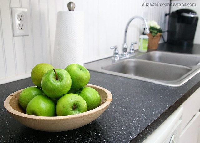
I love to add pops of green to a room, since I feel that it adds a little life to the space. Because no one likes a dead room, right?
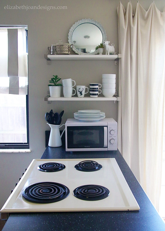
Our open shelving didn’t get springified much, since space is limited there. I did add one small faux plant though!

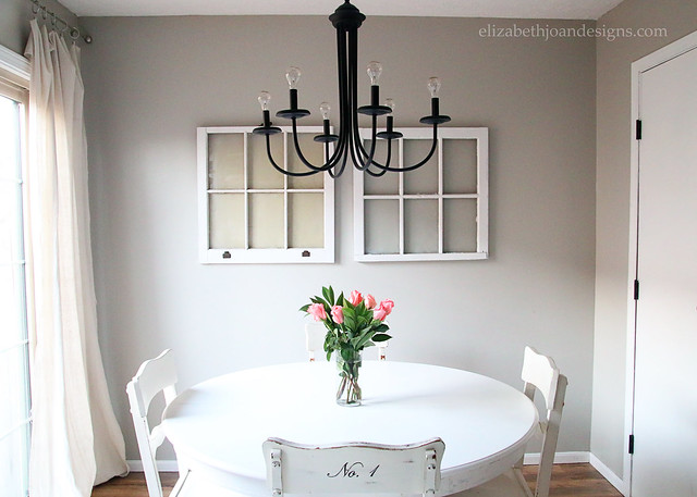
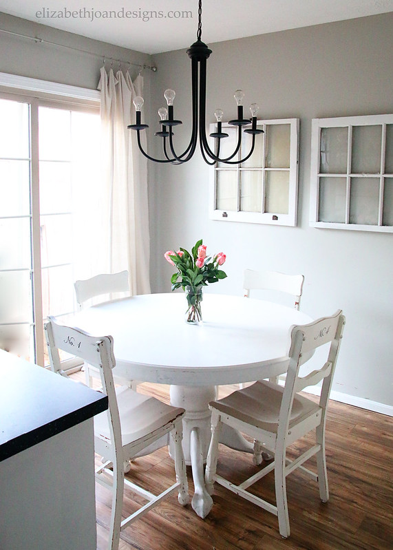
The breakfast nook also looks quite a bit different than in previous home tours.
I found the new (to us) dining chairs at a garage sale for just $1 each and will be sharing how I added the numbers to the backs next week. Stay tuned!
I hope you’ve enjoyed checking out my neutral, modern, farmhouse spring home tour. To see more of our abode not shared in this tour, check out the St. Patrick’s Day Home Tour. If you want to see more amazing home tours and styles, check out the links below. My friends have shared some amazing spaces, so hop on over and check them all out!
Day 1: Transitional and Vintage Decor Style Day 2: Eclectic Style
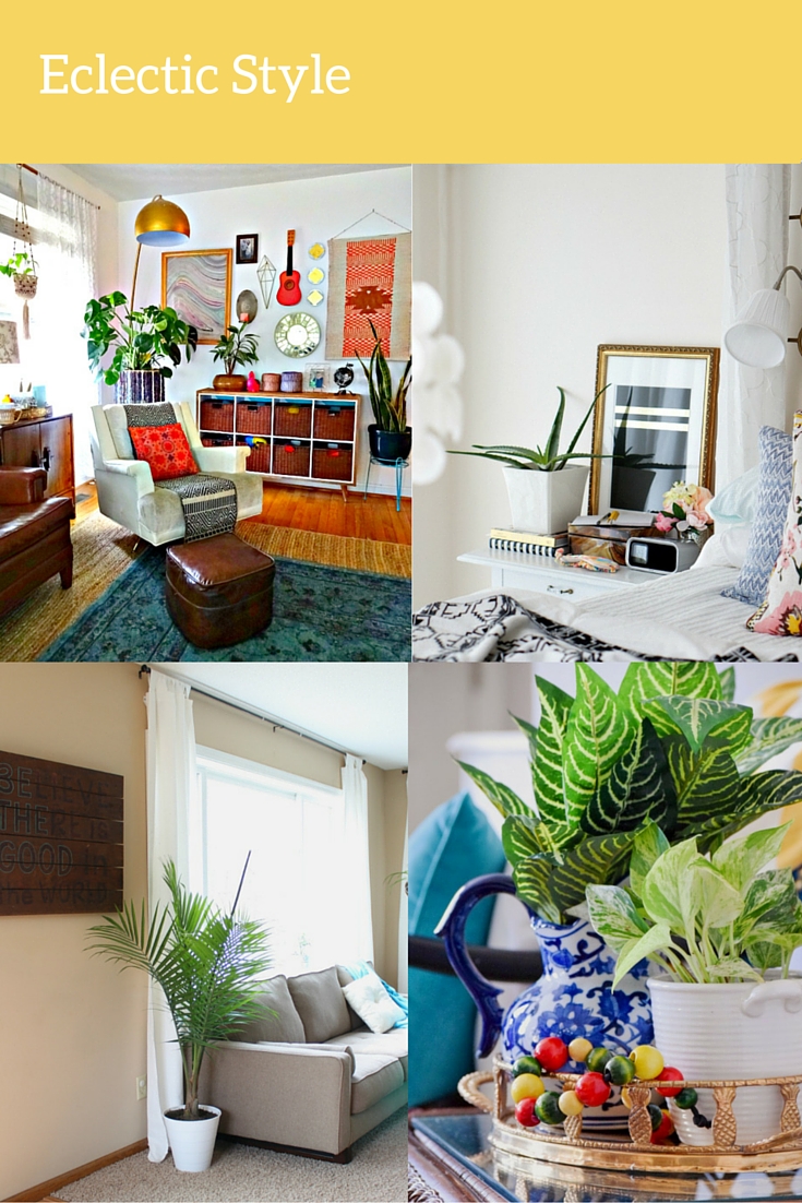 Day 3: Farmhouse Style 1
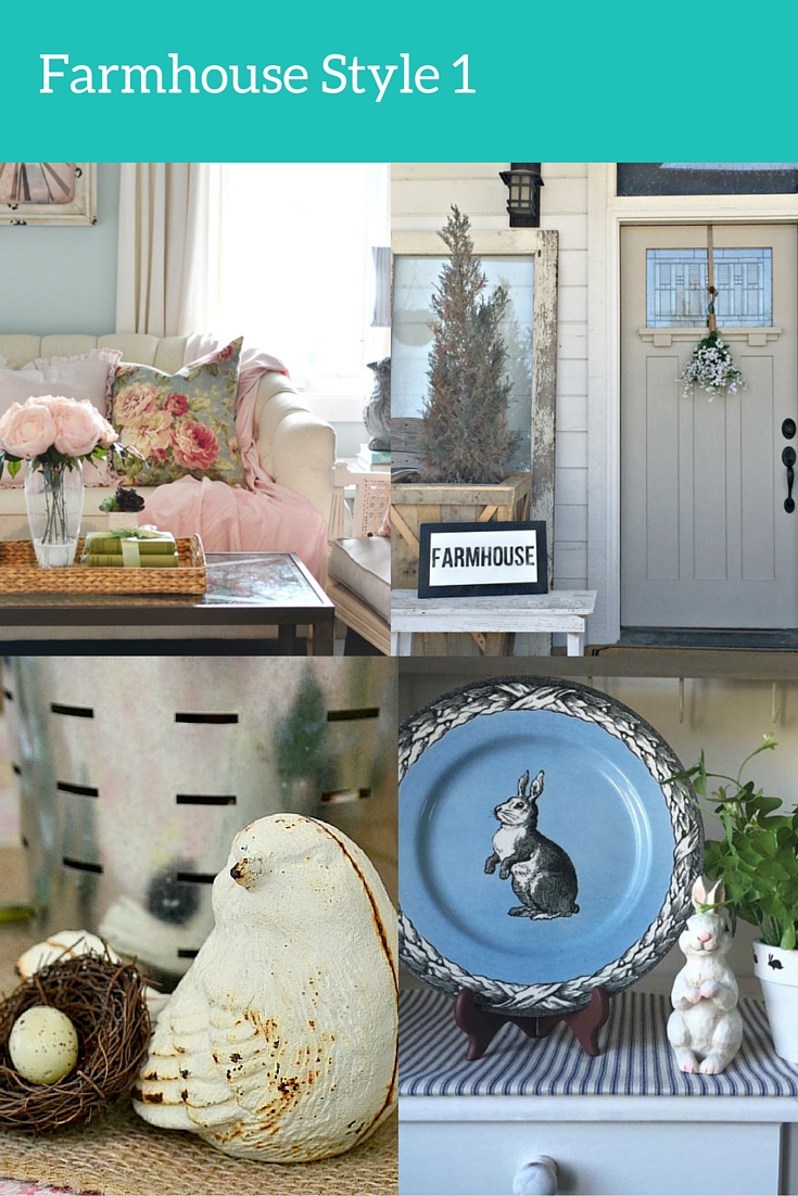 Day 4: Traditional Style
Day 5: Farmhouse Style 2

Lehman Lane
Elizabeth Joan Designs
My Creative Days
Farmhouse 40
My Life From Home