-
Anniversary Art
I’m always up for a simple and easy way to decorate our home. Somehow though, I tend to take on projects that look easy enough, but end up taking way more time than they should. And time is something that we really don’t want to waste right now. However, I have good and bad news. The good news: today I’m sharing a super easy anniversary art idea with you that pretty much anyone can crank out in no time flat. The bad news: I forgot to wish my parents happy anniversary yesterday. Oops! Maybe I can make up for it by making another one of these for them.

Anyway, we’ve actually had this same frame with the date of our anniversary in our home for the past 6 years or so. But to share the detail photos, I decided to redo it for visual effect. Honestly, the hardest part of this project is picking out the fonts you want to use. Especially if you are a font-alholic like me!
First, I chose the 3 fonts I wanted to use for my numbers. I used Jailbird Jenna for the 05, Algerian for the 17, and Edwardian Script ITC for the 03. Then, I just centered each on a 5×7 canvas in Photoshop. (Note: You can also do this using another photo editing/graphics program or even with Microsoft word, etc.)

Next, I printed each of my date numbers out on white card stock. Totes simple. Yeah, I just said “totes,” meaning totally, for all of you who aren’t up on the current lingo of teens and tweens. My 9 year old taught me that.

Then, I cut the card stock numbers to fit the mat board of my frame and used some washi tape to secure them on the back.

After that, I just reassembled the frame and it was ready to hang on the wall. Voila!

This idea would be great as a gift for a wedding and could also be used for other important dates, such as birthdays, etc. The best part is that my husband now has no excuse to forget our anniversary, since the date is hanging on the wall in plain sight all year long.

-
Painting the Town Neutral
Ok, not the town, but our new house! Can I get a whoop?
It’s probably no secret that I’m a big fan of neutral color palettes. I love color, but for some reason I’m always drawn the the neutrals when I start putting our home together. (Black, white and gray anyone?) Since our previous place was a rental, we weren’t allowed to paint. And almost everything was covered in FLAT white paint. Ugh. Don’t get me wrong though. I love, love, love white. But when you have 2 kids and 2 dogs, flat paint just doesn’t cut it. I need washability people!
To say that I’m excited to change things up is an understatement. Honestly, I happier than Pharrell to be able to put that brush to the wall. (Just try and tell me that you can listen to that song and your day is not a even a little brighter!)
Click here to open the Pharrell Williams – Happy (Official Music Video) on Youtube. Together with my husband, we picked out some soothing colors that will hopefully flow well together. All of our color choices are from Benjamin Moore, except for one from Restoration Hardware. Weird how that worked out.

This is just an initial paint palette and is subject to change in the future as we start getting color on the walls and decorating. Let’s take a closer look at which colors will be used for which spaces, shall we?

The main floor of our home is painted with yellows, oranges and browns, lending to that Tuscan feel. I can definitely see how those colors could liven up a space with the right decor. But as I mentioned before, I’m a neutral girl, and Tuscany is more of a place that I, personally, would like to visit vs. live in, so we are doing things a bit differently for our kitchen, living room, and family room/ playroom.

As I mentioned before, I love white, but we just hated the fact that our rental was painted with flat paint, although having white walls was really wonderful for some photography stuff. So we are planning on using some white eggshell finish paint in our bedroom. Our son’s room will get the gray treatment and our daughter chose a calm and airy blue.

Neither of our bathrooms have windows, so I’m hoping that these colors won’t make them seem too dark or smaller than they are. We may end up adding some sort of wall treatment too, if we need to brighten up the spaces more.
So, that’s the direction we are planning on going. We haven’t figured out paint colors for any of our storage spaces (laundry room, pantry, etc.,) but there will be plenty of time for that after we get the main living areas of our home looking how we want them. Yeah, that includes not only painting the walls, but the trim as well. Sounds like fun, right?
-
His & Hers Valentine’s Day Gift Guide
The big day is quickly approaching and we wanted to share some last minute ideas for his and hers Valentine’s Day gifts. All of items below go above and beyond the typical flowers and candy notion and will hopefully keep you from sleeping on the couch for the rest of February. *wink*

His – Keychain Multi-Tool, Arber Aftershave Balm, Marine Ribbed Scarf, Icon Whisky Stones, Classic Baseball Cap, Printed Rubber Case for iPhone 5/5s
Hers – Must-Have Infinity Scarf, Urban Decay Naked3, Infinity Love Knot Pendant, Angels Heavenly Angel Mist, Leroy Street Glitter Bee Wristlet, Figuier Diptyque Candle
__________________________________________________________________________
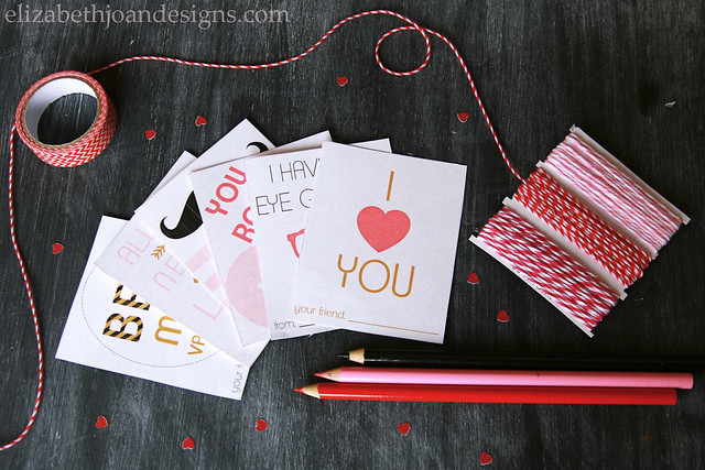
Don’t forget to check out our FREE February Printables if you haven’t already! Included are a simple, fill-in calendar and fun Valentine’s Day cards.
-
LOVEly Heart Candle Holder
So, here at EJD, we thought it would be a great idea to do a week of Valentine’s Day type projects. I was racking my brain, trying come up with something to no avail. It was like trying to make “fetch” the new word for cool, and it just wasn’t happening. That’s so fetch. Umm, no. No it’s not.
Anyway, after perusing the aisles of the dollar store, putting things into my cart that I really don’t need, I found a small glass candle holder and decided to try and make it more lovey dovey.

For this simple project, I used my candle holder, blue painter’s tape, scissors, chalkboard paint, and a foam craft brush.

Oh, and also a pen (not pictured above.) With the pen, I free handed the shape of a heart onto the sticky back side of two pieces of painter’s tape. I chose the back because I figured my tape might lose a little bit of its tackiness if I put it down on a surface. Generally, it is not
fetchcool for people to be tacky, but with tape, it is expected.
Next, I used my scissors to cut out the tape heart and attached it to the candle holder.

Then I covered the entire glass with several coats of chalkboard paint. You can see in the photo below that there was a little, ahem, leakage under the tape.

Luckily, it was easily fixable with
my tonguesome water and a paper towel. I just wiped it off while it was still wet, but you could totally use a sharp edge to scrape off any excess once it is dry.
I think I did a total of 3 coats of paint. I love the contrast of the matte look that the chalkboard paint gives against the shine of the glass. I don’t love that the paint looks so textured, but you could totally fix that by using spray paint instead.

This heart candle holder also has a neat little trick up its sleeve. If you face the unpainted section towards the wall, the light from the candle will shine through and make a fabulous heart shaped projection. Pretty
fetchcool, right?